North design system
Background
North is a design system built for Hack the North that allows us to build tools for our hackers and sponsors at lightning speed while maintaining a consistent look and feel.
Our main goals for the design system was to:
- Speed up design and development with ready-made components and patterns, allowing for faster prototyping
- Create a solid foundation that we can build upon without needing to re-design and re-build our components each year
- Promote accessibility by ensuring that all our components and layouts are fully-accessible for the end user
Principles
Accessibility
In previous years, we didn't give much thought to accessibility. North ensures that all components comply with WCAG AA accessibility standards, being keyboard accessible, screen-reader friendly, and with sufficient contrast ratios.
Customizability
Many design systems are rigid in their styling, with CSS colors, fonts, and spacing baked into each individual component. This makes changing the design system difficult and refactoring often results in find/replace hell. North is built off of a set of tokens in tailwind.config.js, so that changing something like the primary color is a one-line change.
Flexibility
One of the biggest gripes we had with existing design systems was the lack of flexibility when using them in development. Components would often be created with a limited set of props or type definitions that pidgeonhole you into using that component in a very restricted way. We believe that developers should be given full-control and that design systems should be built to be as flexibile as possible. In North, components are built to be as similar to their HTML counterparts as possible, so that you can build anything you think of.
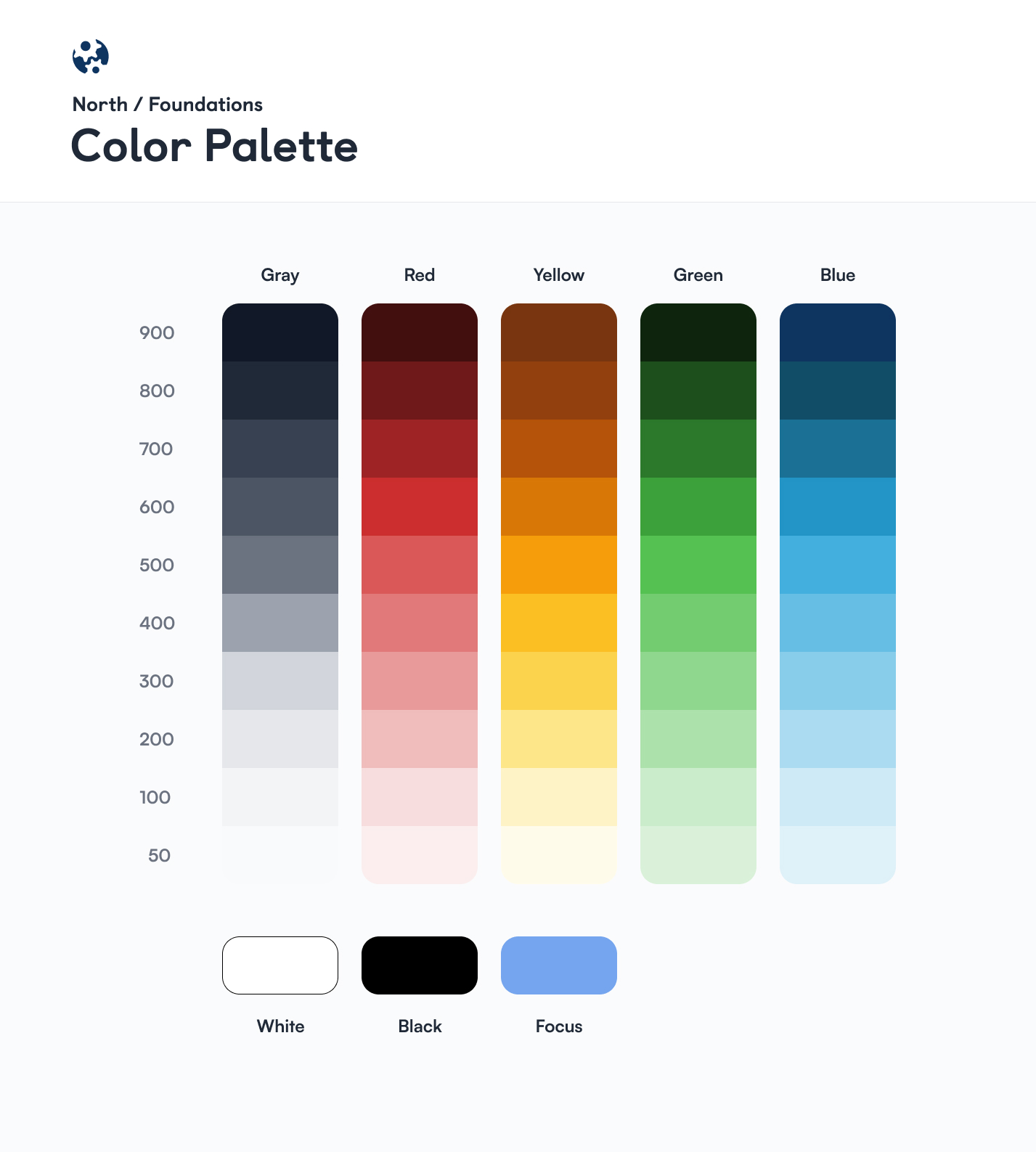
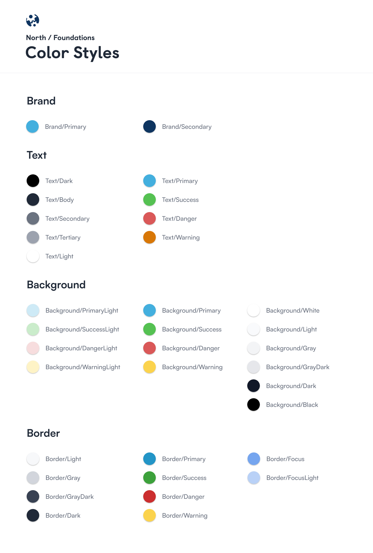
Colors
The way that North handles colors is different from most design systems. There is a base color palette that defines all the possible shades of a color, and the color styles that are used end up being proxies from the color palette. This maximizes flexibility and assigns semantic meanings to the colors (for example, danger-colored text/borders being darker than danger-colored backgrounds).
Typography
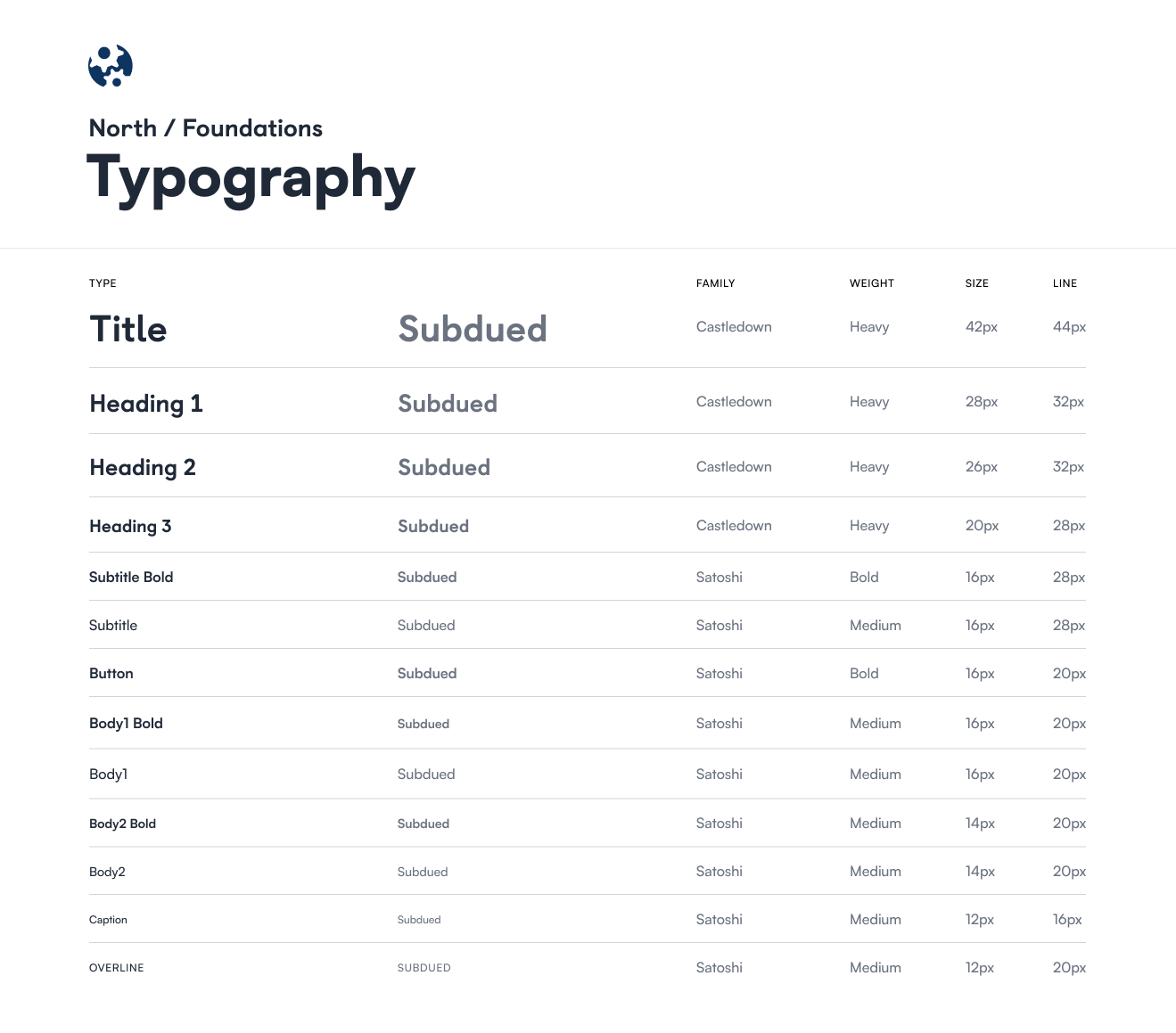
North uses two main fonts in its design: Castledown and Satoshi. Castledown is used as the font for headings and chosen for being friendly, playful, and dyslexic-friendly; Satoshi was chosen for a similar reason for being playful in contrast to most plainer sans-serif fonts in the tech industry.
Typography was organized in a similar way to colors: there are a set of base tokens corresponding to font sizes, and then a Text component that organizes them into semantic groupings.
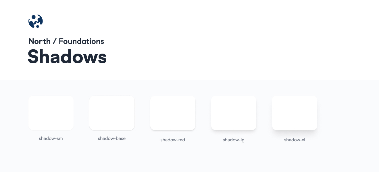
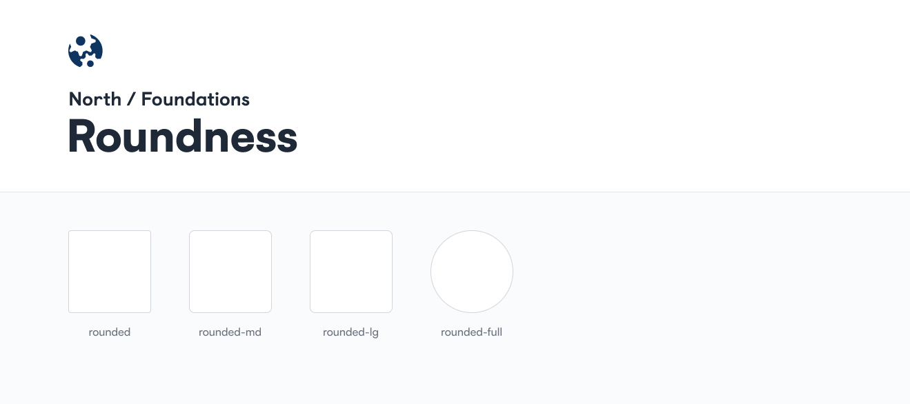
Shadows and Roundness
The last thing we standardized into tokens were shadows and border radii. These tokens were named the same as they are in the frontend implementation.
Components
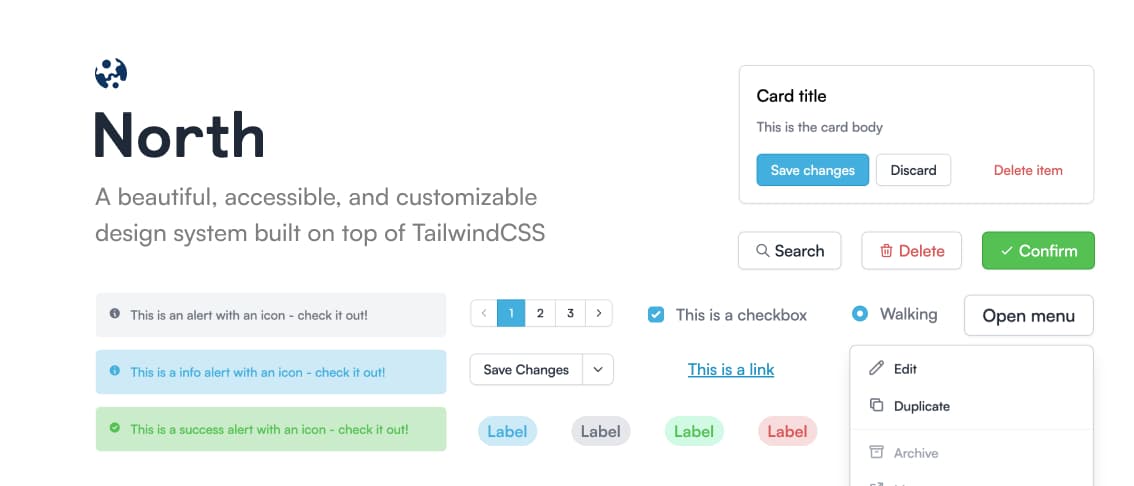
With all of the atomic design tokens, building a component library proved to be relatively easy. Using Figma auto-layout and variants, we built a library of more than 15 basic components. Since it doesn't make sense to show every component we built, here's a preview of our Button component.
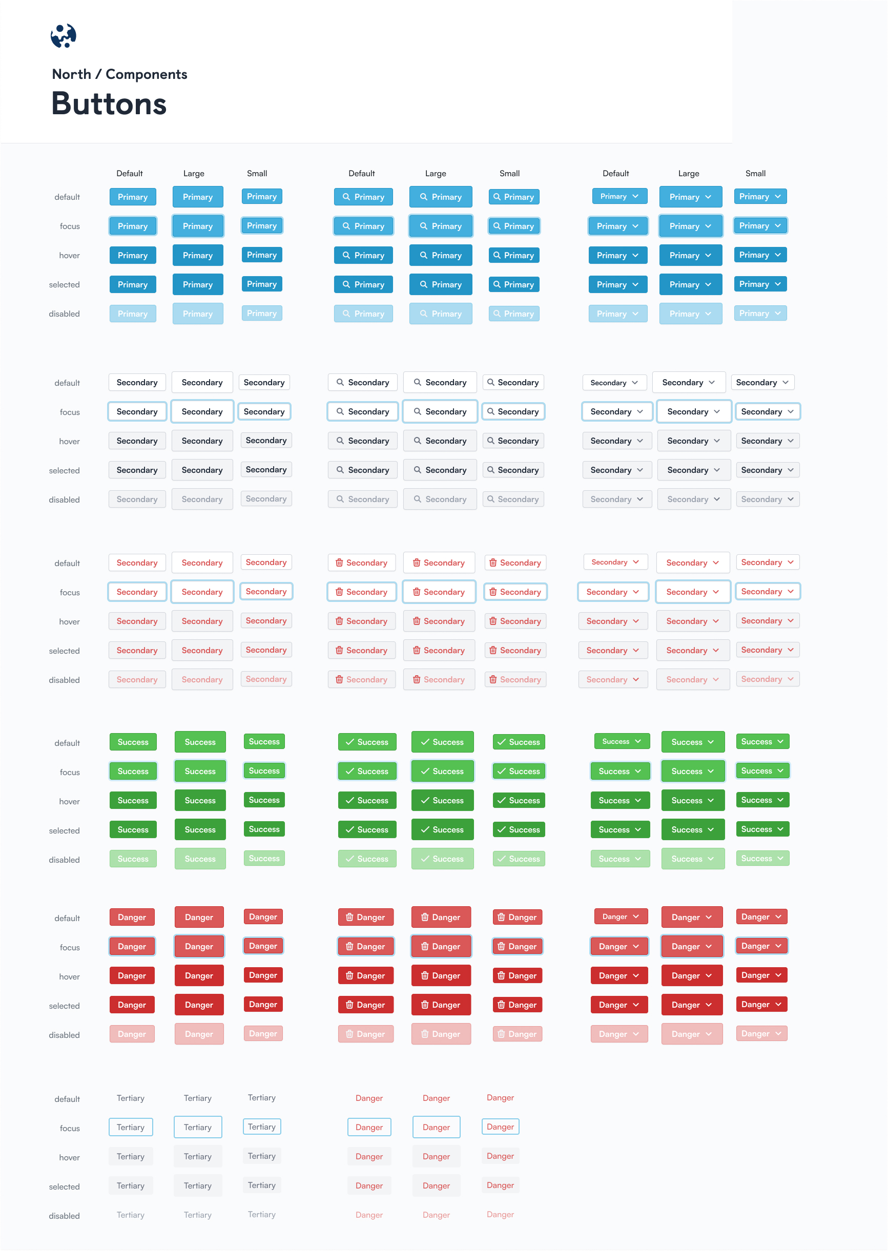
Some things to note is the inclusion of the focus state that many design systems neglect - this is important for keyboard accessibility.
Another note is the sizing: we standardize the sizes/spacing of all our components so a small button placed inline with a small input will sit flush with each other with the same height.
Engineering a design system
In implementing North, we used the following libraries:
- Vite as our build tool for instant changes and fast builds
- TailwindCSS as a CSS framework for its modularity and customizability
- Emotion for CSS-in-JS with Tailwind autocomplete support
- HeadlessUI for basic accessible components
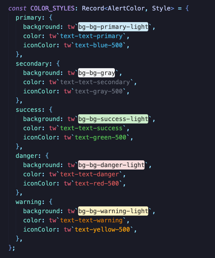
All of the design tokens (colors, typography, shadows, borders, etc.) were defined in the tailwind.config.js file. These tokens are later used to build out the base styles of each component. Here's an example of our Alert component:
To ensure that our design system says flexible and customizable to the user's needs, we try to keep our interfaces as generic as possible by propagating props down to the base HTML element.
Some components are also dynamically controlled/uncontrolled, which lets you decide whether you want to manage the internal state of the component yourself.
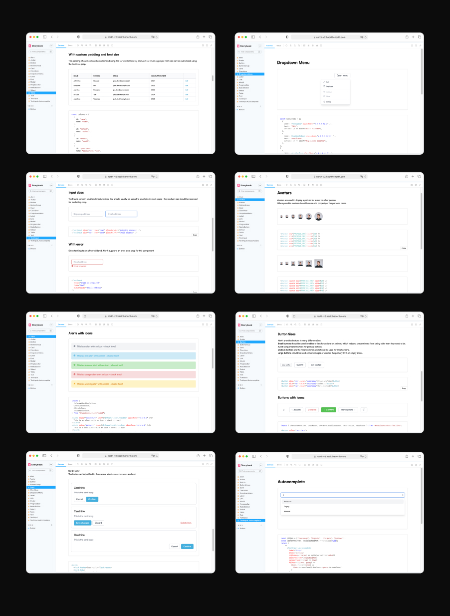
Documenting a design system
Our design system is currently documented using Storybook. Each component has a documentation page with interactable examples with code snippets below.
Here's a preview of some pages from our documentation:
Using North at HTN
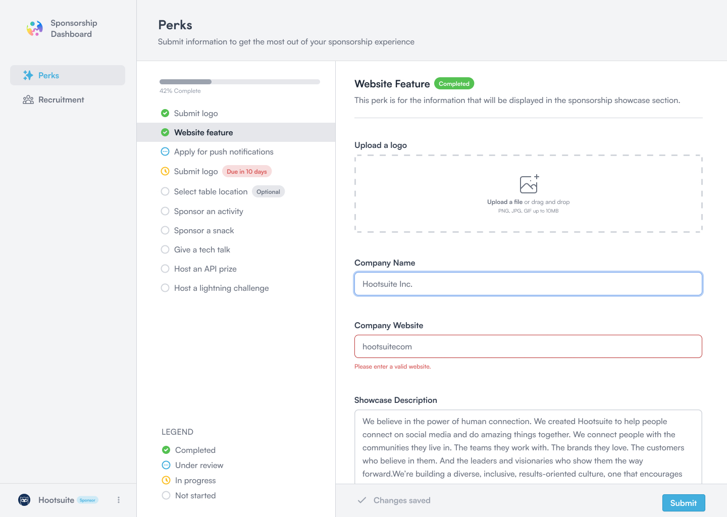
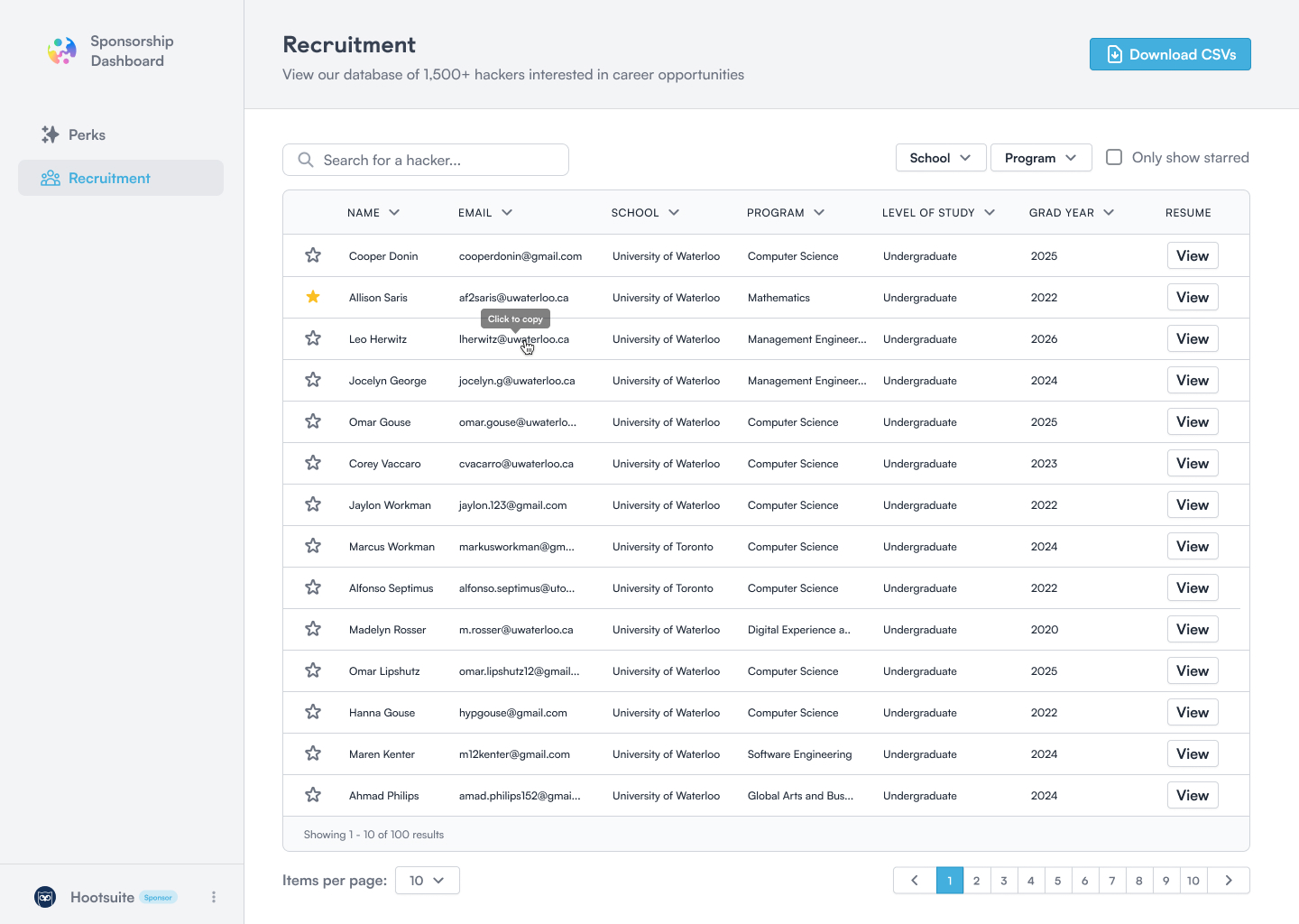
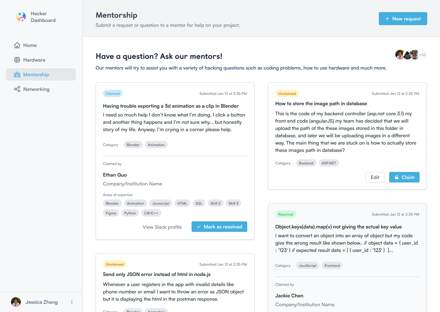
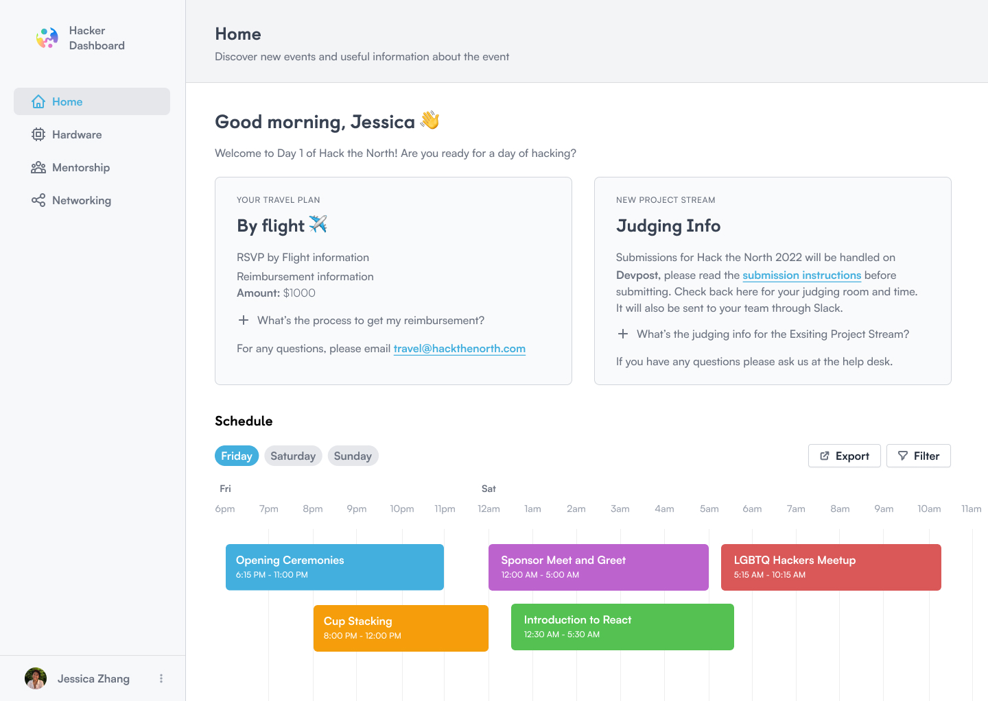
Using North, we've been able to build a bunch of different tools already.
- A tool for sponsors to submit perks for the event
- A recruitment tool for sponsors to view and filter hacker resumes
- An RSVP form for hackers to submit pre-event and travel information
- A scanner tool for event check-in and hacker networking
- A hardware tool for hackers to sign-out and request hardware
- A mentorship tool for hackers to request help from a mentor
- A day-of-event dashboard with the schedule and judging information
Below are some screenshots of what we've managed to build using this new design system: